If there
was ever any universal advice offered to first-time authors who wanted to
self-publish their new book, it would be, “Don’t even think of designing your
own cover. Hire a professional.” Did I listen? No, of course not. Last
February, after my first draft was complete, I turned my attention to covers.
That would be fun, would it not? Fortunately, I was a decent photographer and
had a background in design. So, this should be easy, right?
My early
working title was “Beers in the Stream,” but as time went on, I realized that
it said nothing about the scope of the book and the story arc, except in a most
peripheral way, that would surely confuse everyone, except me. So, that title
simply landed on the chapter about our adventure to Lake Ingalls and the
subsequent classic ascent of the North Ridge of Mt. Stuart. Unfortunately, the
photo of the beers in the stream doesn’t even show up in the book.
So, I scanned
my library of photographic images, both vintage and contemporary, and selected
over forty that I thought showed cover potential. I cropped them and assembled
them in a photo gallery to mull over. After paring it down to a dozen, I mocked
them up, with half a dozen potential titles, more subtitles, and with an
array of fonts. The permutations counted well over a hundred mock-ups. And even
then, I wasn’t happy with the fonts.
At first,
I loved the look of Charlemagne Standard, a font designed in 1989 by Carol Twombly,
with basic forms modeled after those used in classical Roman engravings. But
after further examination, it seemed that fancy serif fonts in color weren’t going
to provide the requisite visual impact when the cover was reduced to thumbnail size on a
bookseller’s website. And, it turns out that the choice of serif versus sans serif has
a lot to do with the genre of your subject. No, I am not joking.
So, I went to phase two, mocking up the best contenders to pick a final font. It turns out that a bold sans serif white font has the most visual impact for book covers, at least in my chosen book genre. After trying many, I settled not on Helvetica, which I had known since my days in college as an architecture student, but on one I had never heard of before. Its name is Mesmerize. And it mesmerized me. From the moment I composed it as text over my cover photos in Photoshop, I knew it was the one. I breathed a sign of relief. Another hurdle crossed.
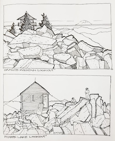
And from
those new cover candidates, I finally picked my title, Banquet of the Infinite. The final decision on the subtitle would take even longer. While I
fell in love with my night sky Milky Way photo with Granite Mountain Lookout in the foreground, I
wondered if potential readers might equate the title with an exploration of the
universe. No, not quite right. Next.
This
early self-portrait was shot with the self-timer with my Nikon F film camera
looking out at the Sierra peaks from inside Omnipotent #13, back in 1973. And
while I like it, I knew it wasn’t the cover shot. It’s a crop from a horizontal
image, so somewhat compromised, and I was concerned that it might be confusing,
and perhaps a little busy visually. Next.
This
image of me hiking up a creek bed in the Sierra appealed to me but then again,
most of the memoir stories take place in the Pacific Northwest. Again, I was
concerned that potential readers might be too 'concrete literal' in their
expectations based on their perception of the image. Next.
I love
this vintage image that I took in 1977. And, it appears in the book chapter titled “Warbonnet and Wolf’s
Head.” Diane standing on the boulder, looking into the distance, under the prominent
feathered crest of Warbonnet Peak, has that Maxfield Parrish ‘girls on rocks’
thing going on, and I think it’s incredibly romantic. It is, however, a bit visually
busy with the graphics and it might not make sense to a potential reader when
seen in an online thumbnail image on a bookseller’s site. Let’s see if I can do
better. Next.
I took
this shot of Dragontail Peak while pausing during the trudge up Aasgard Pass
with David Stevenson in 2019. I love the drama with the fractured granite and
golden larches. And we’re back in Washington. But again, is it too busy? Next.
Later,
that same day, as the temperature plummeted and the gray rolled in, the image
seems even more ethereal, and dare I say, infinite. Not bad, but is it the one,
the one that will draw in a potential reader? And again, is it too busy? Next.
And now,
simpler with more diffused light and more contrast and clarity with the title
font. But is it both intriguing and welcoming? Or is it too gothic and dour?
Next.
Finally.
It’s a clear, crisp, simple image of Lake Ingalls with Mt. Stuart both on the
horizon and in reflection. A simple grab shot from a solo hike during the 2020 pandemic turned out to be a pleasant surprise. I think it speaks to the title
and is both intriguing and welcoming. Done!
My engaging mountain memoir, Banquet of the Infinite, is now available as an
eBook on Amazon, Barnes & Noble, and Kobo.